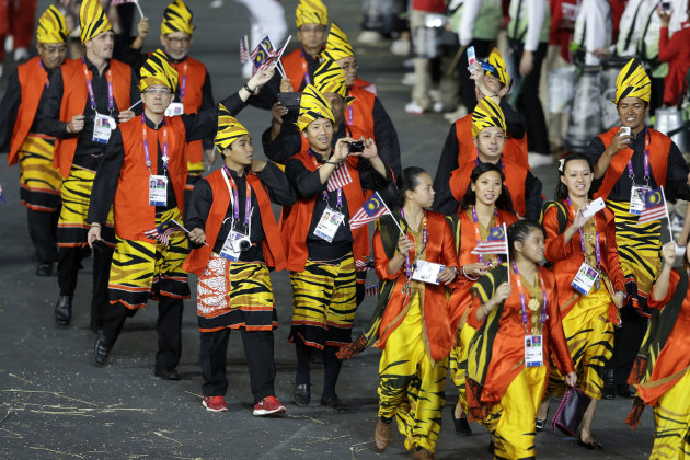
Berdasarkan pemerhatian dan komen di bawah. KIta mungkin tidak bersetuju dengan pandangan pengkritik terutama tentang pakaian yang terlalu ringkas. Apa pun ini merupakan pandangan yang boleh dipertimbangkan oleh pereka pakaian kontingen Malaysia di masa hadapan.
Best and worst team uniforms
A look at some of the Olympic team uniform hits and misses at the London 2012 Opening Ceremony. -- By Tiara Chiaramonte
http://sports.yahoo.com/photos/olympics-best-and-worst-team-uniforms-slideshow/the-associated-press-photo-1343435443.html
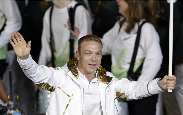
Worst
Britain's uniform was a huge miss. The metallic gold lamé collar on the white track jackets looked like something from the 1984 Olympics.
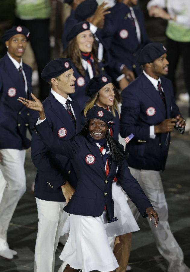
Best
Despite initial criticism for the U.S. uniforms being "Un-American," when Team USA walked out the uniform looked winning.
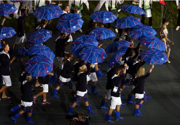
Worst
Patterned blue umbrellas with matching rain boots made a bold statement for the Czech Republic, but not necessarily a good one.
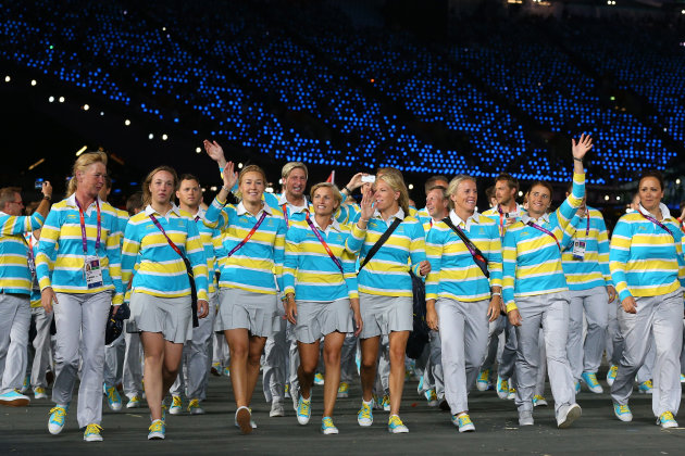
Best
The Swedish uniform played the complimentary colors of their flag perfectly with stripes and simple grey bottoms.
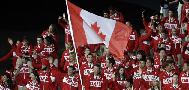
Worst
Canada's one of the only countries that opted to put their country's name on their uniform. The choice was a little tacky and dated.
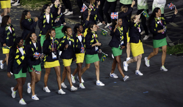
Best
Brazil's green and yellow miniskirts were a very risky style choice that ultimately ended up looking very flattering on their female athletes.
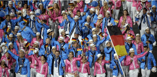
Worst
The colors pastel pink and blue went out of fashion in the early 90's but for some reason Germany decided to incorporate the two into their uniform
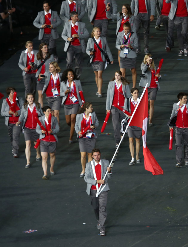
Best
The pop of red in Switzerland's grey uniform was a winning contrast of colors.
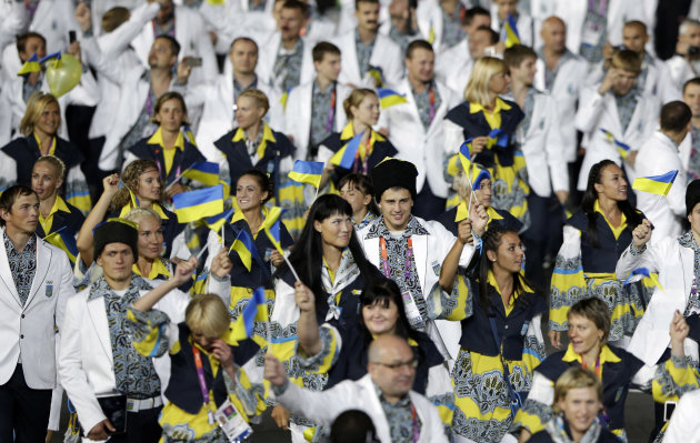
Worst
The Ukraine's uniform could have been passable, if they got rid of that horrible paisley print and dated collared top for the men.
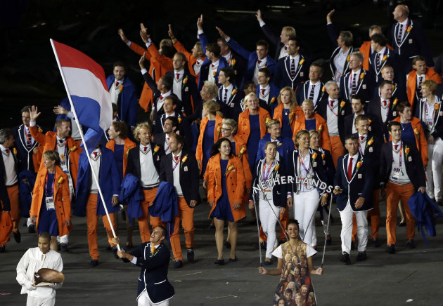
Best
The Netherlands had the best uniform of the evening, successfully managing the tricky task of pairing blue and orange.

Worst
Malaysia's tiger printed yellow, orange, and black uniform was a little too bold.
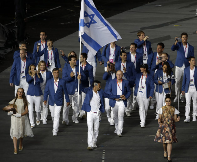
Best
Israel's simple uniform of a blue blazer with a white shirt and pants was refreshing in a sea of bright multicolored uniforms.
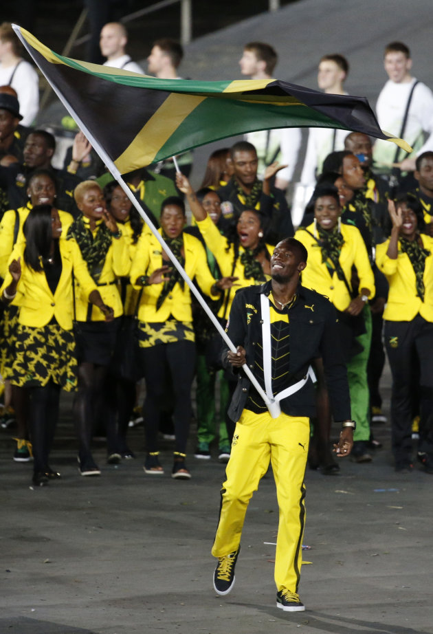
Best
On first glance the Jamaican team's bright yellow pants and blazers might seem over-the-top, but paired with understated black bottoms and a stylish patterned scarf, it pulls together the neon color seamlessly.
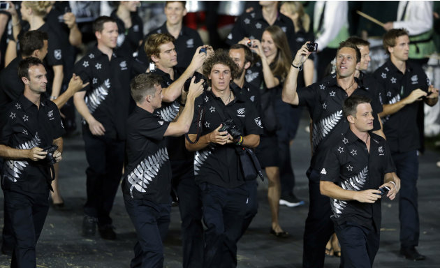
Worst
New Zealand's uniform fell flat because of a monotone color palette. The matching black tops and bottoms with silver patterns were just dull.
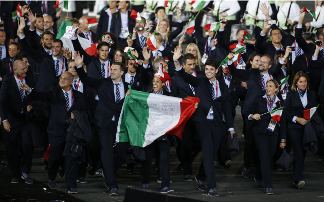
Best
Giorgio Armani designed Italy's uniform and the uniform embodies his aesthetic -- a perfectly tailored suit. But it would have been nice to see the women in something a little more feminine.
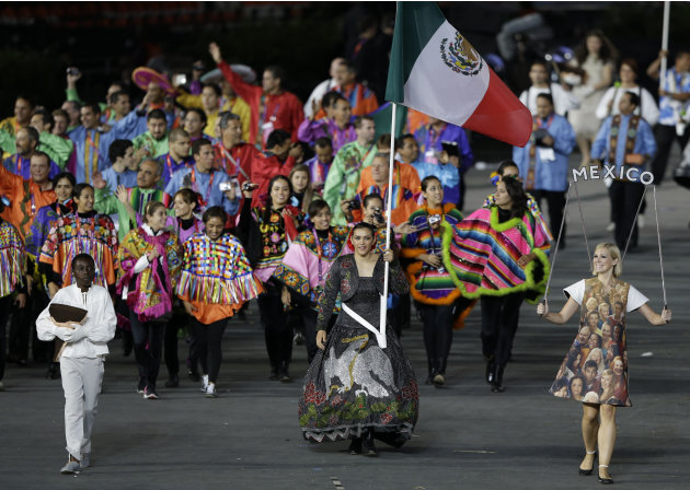
Worst
Mexico's uniforms were over the top. The uniform was a combination of different traditional Mexican clothing in very bright statement colors.
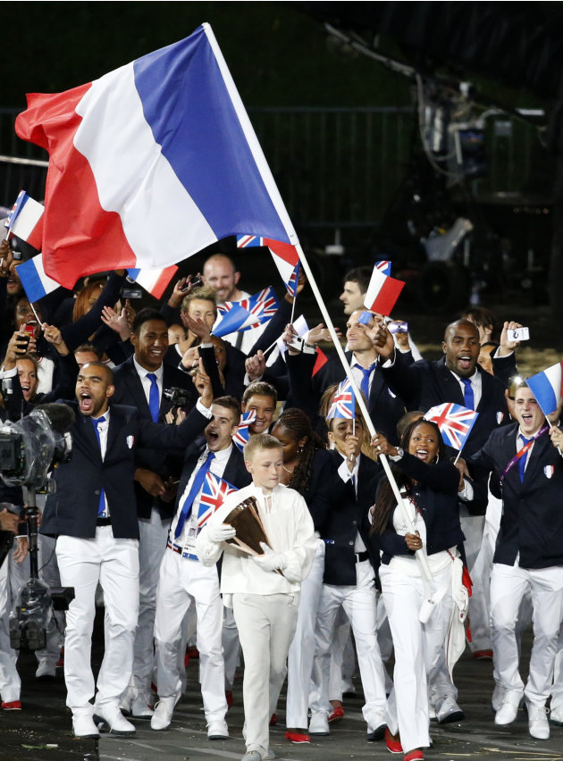
Best
Paris is the fashion capital of the world and France's uniform reflects that -- clean, simple, and classic. The women's uniform red flats were also a nice surprise of color.


No comments:
Post a Comment